

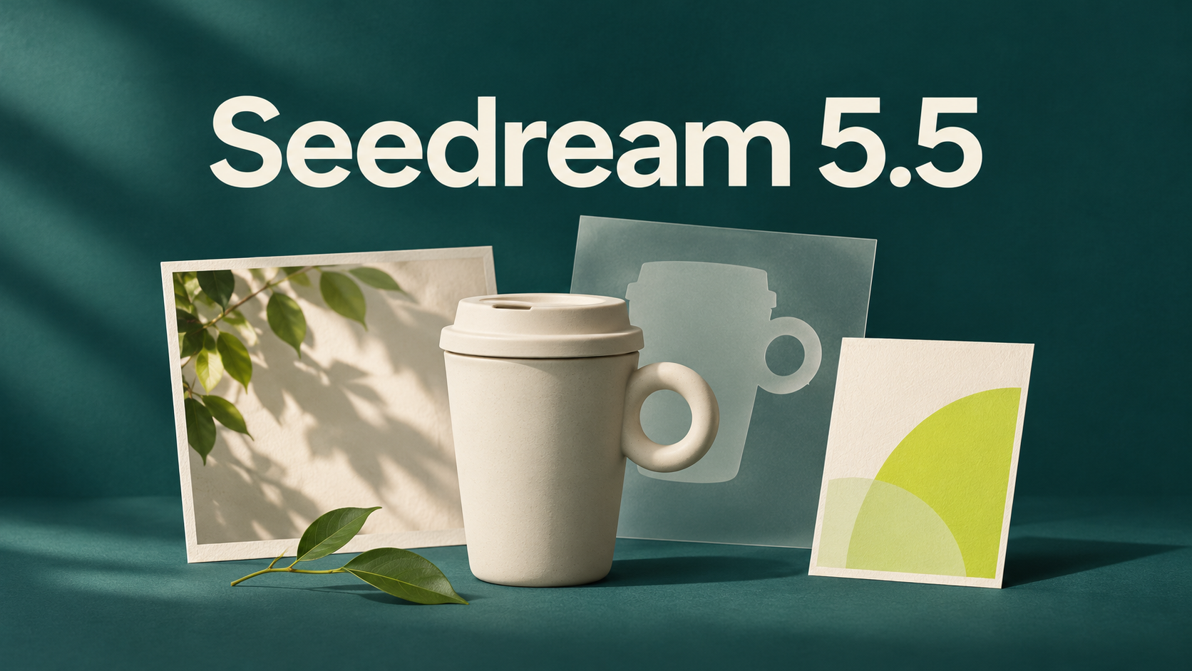
Seedream 5.5 officially launched on November 9, 2026. ByteDance Seed emphasizes more stable editing, native RGBA assets, and improvements to realistic imagery and small text. For ecommerce designers, brand teams and content creators, a useful first project is a campaign built from one product reference: assets you can revise, reuse and arrange for different placements.
This guide uses an ivory ceramic travel cup to work through three practical tasks: transparent decorations, revisions to a main visual, and bilingual posters. It includes reusable prompts and acceptance checks. These are proposed workflows based on the announced capabilities, not hands-on test results from our team.
Seedream 5.5 is released: what can you do with the update?
Source: ByteDance Seed, November 9, 2026 announcement; authentic page excerpt captured the same day.
The announcement demonstrates 100 successive edits to one portrait and introduces direct generation with an alpha channel, which controls transparency. It also describes improvements to materials, skin and lettering. Here is how we suggest putting those capabilities to work:
| Your task | A useful experiment | What to check before delivery |
|---|---|---|
| Add reusable campaign decorations | Create separate transparent stickers, ribbons or graphic elements | Real transparency and clean edges |
| Work through design feedback | Revise a specific object from an approved version | Product geometry, labels and placement |
| Build a poster with images and copy | Supply exact wording, reading order and space requirements | Spelling, missing text, numbers and mobile readability |
The 100-round sequence is an official demonstration, not a guarantee that every image survives 100 edits unchanged. Save approved versions and return to one when a later revision drifts.
Start with a deliverable list
Imagine launching a ceramic travel cup. Before asking for a stylish poster, prepare three things:
- Product references: a clear photograph of the silhouette, plus a detail image for any important label or pattern.
- Visual requirements: an ivory cup, a deep teal background and soft side lighting. The rim and circular handle must retain their original shape.
- Approved copy: “把日常,慢慢喝。” for the Chinese version and “Make time for a slower sip.” for English. Do not ask the model to invent a price, capacity or product claim.
Plan a square product card, a portrait campaign poster and a vertical mobile cover. The 1:1, 4:5 and 9:16 ratios are design targets for this project. If your generation interface does not offer one of them, adapt the canvas in a layout editor.
If reference-led creation is new to you, start with our image-to-image workflow. When separate references control product shape, mood and composition, state which one takes priority if they conflict.
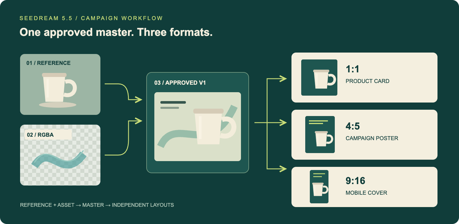
Editorial workflow diagram. Each format starts from the same approved master so an awkward crop or flawed revision does not carry into the next deliverable. Ratios are design targets, not platform parameter limits.
Use case 1: build reusable transparent campaign assets
Separate the real product from newly generated decorations
When a product needs to match its physical appearance, keep the original photograph as your subject. If it only needs a clean cutout, a background removal tool can prepare the product image while you generate decorations separately. That makes the rim, handle and printed details easier to verify.
Native transparent output is worth exploring for reusable elements such as translucent ribbons, embroidered-style stickers or isolated accents. Make one element first, check that it composites correctly, then expand the set.
Example prompt: a translucent decorative ribbon
Design one isolated pale teal ribbon with a translucent glass-like material for a ceramic travel cup launch. Use a simple curved shape, delicate edges and soft light from the upper left. Generate only the ribbon: no cup, text, tabletop or background scene. Output an image with a transparent background and an alpha channel, preserving partial transparency within the ribbon. Do not draw a checkerboard pattern. Leave safe margins around the object.
Use an interface that supports transparent output, choose an export format that preserves it, and download the original file. Place the ribbon over both deep teal and warm ivory backgrounds. Check whether the center lets the background show through, whether the outline has white halos, and whether an opaque rectangle surrounds the asset.
A PNG extension alone does not establish transparency. If the checkerboard moves with the image, check whether the preview pattern has been baked into the file.
Reuse the set across layouts
Keep separate originals for the product, decorations and background. Place the ribbon behind the cup in the square card, near the headline in the poster, and use fewer decorations in the mobile cover. Managing copy and prices separately in a layout editor makes later changes easier.
Use case 2: turn design feedback into focused editing instructions
First establish the product geometry, placement and lighting. This prompt provides a starting point:
Use the product reference as the sole source for the ceramic travel cup's shape. Preserve its lid, rim, circular handle and body proportions. Create a launch visual with a deep teal background, the cup in the right half and clear headline space on the left. Use soft light from the upper left and a natural contact shadow beneath the product. Do not add text, logos or other products.
Save a result you approve as master V1. Write each subsequent request in three parts: what changes, what stays, and what completion looks like.
Example prompt: change only the background color
Change only the background from deep teal to a muted warm gray. Preserve the cup's ivory color, glazed texture, lid, handle shape, size and position. Retain the empty space on the left, the lighting direction and the contact shadow. Do not introduce decorations or text.
If the next request is to increase the headline space, handle composition separately. Combining a material change, a new viewpoint and added text makes it harder to identify what went wrong. For practice with this style of instruction, try a small revision with our prompt-based image editor.
Keep approved and candidate files in separate groups. A candidate becomes the basis for another edit only after it passes inspection. Branch different directions from the same approved master: keep warm gray and deep teal versions separately instead of asking the gray version to recreate the teal one.
How do you accept an edit? Zoom in on the rim, inner handle edge and fixed surface details, then zoom out to review the composition. A correct background with a distorted product still needs another attempt. If your interface provides a selection or mask, use it to constrain the region further.
Use case 3: create bilingual posters with deliberate text hierarchy
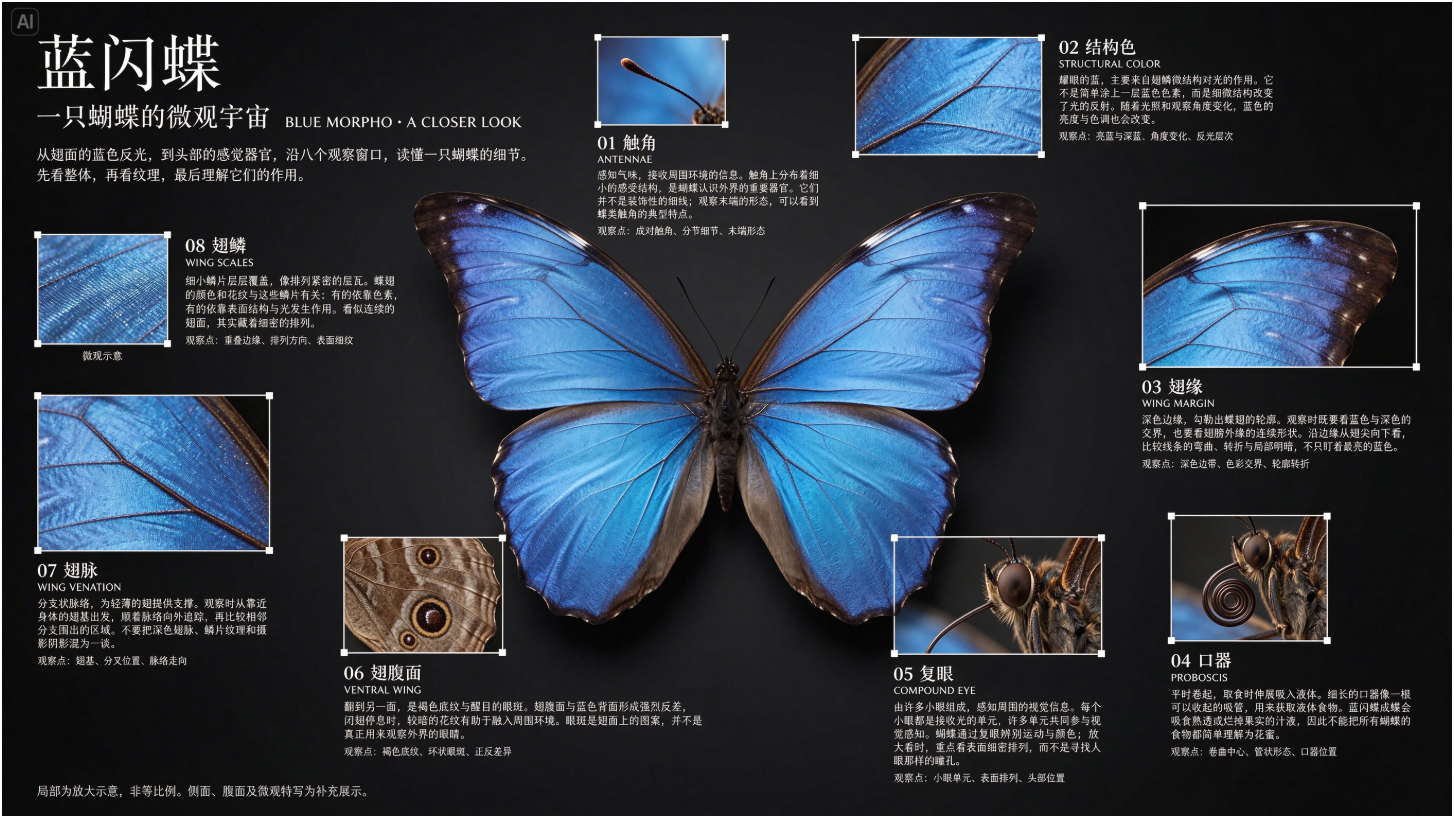
Source: ByteDance Seed's November 9, 2026 small-text example. Supplied by the model publisher; not our own test output.
This example is useful for examining hierarchy: a main subject, enlarged details and small annotations organize information together. For a campaign poster, decide where the headline, supporting copy and product belong before deciding how much text to include.
Create Chinese and English versions separately. Replacing a short Chinese headline with a longer English sentence often calls for new line breaks and spacing.
Chinese poster prompt
基于已确认的商品主视觉制作竖版活动海报。保持杯子外形、奶白色和光线方向。上方标题分两行,第一行严格为“把日常,”,第二行严格为“慢慢喝。”。下方小字严格为“陶瓷随行杯”。除这些文字外不生成其他文字。标题最大,说明文字次之,商品清晰突出;四周留白,不让飘带遮住文字。
This supplies the exact Chinese headline and a smaller “ceramic travel cup” caption, with no additional copy.
English poster prompt
Adapt the approved product visual into a portrait campaign poster. Preserve the cup's shape, ivory color and lighting direction. Set the headline on two lines: “Make time for” and “a slower sip.” Add only the smaller caption “Ceramic travel cup”. Do not add any other text. Keep the headline prominent, the cup clearly visible, and generous margins around all text. Keep decorative elements away from the lettering.
The wording is illustrative. Substitute approved brand copy for a real project, particularly where discounts, capacity or environmental claims are involved.
Review twice: first at full size for spelling and punctuation, then at the size someone will actually see on a phone. Text that looks clear in a large image may become unreadable in a feed. If repeated attempts still produce errors, keep the approved image without text and add the final copy in a layout editor.
Three more projects to try
| Scenario | A manageable first project | Details to keep consistent |
|---|---|---|
| Community stickers | Give one cup mascot happy, sleepy and celebratory expressions; export separate assets | Body proportions, colors and eye placement |
| Interior display concepts | Try three arrangements of a cup, books and a vase in the same desk photograph | Desk dimensions, window position and perspective |
| Product instruction cards | Illustrate three supplied steps as separate cards, then arrange them as a set | Factual steps, product structure and visual style |
Start each project with one approved reference image before expanding the series. Supply the facts and product knowledge yourself; use the model to explore their visual presentation.
Where to start, and what to check before handoff
The Chinese launch announcement says Seedream 5.5 is rolling out across Jimeng, Doubao, Doubao Work and Volcano Ark. Check for the model in your image-creation interface, then review the export options and cost shown for your account. A Seedream 5.5 Pro version is planned separately; this announcement does not establish its simultaneous release.
Visit our Seedream 5.5 overview and updates, or explore further creative use cases on the Seedream 5.5 topic site.
Before handing off the campaign, check that:
- Product contours, markings and important details match the original reference.
- Transparent assets have been checked on dark and light backgrounds, and downloaded files preserve their transparency.
- Chinese and English copy has been proofread, including numbers and punctuation.
- Square, portrait and mobile layouts have been composed separately without clipped headlines.
- Original references, approved masters, asset files and final exports are saved separately.
If the approved artwork needs more pixels, use an image upscaler, then inspect the lettering and edges again. Upscaling does not correct a misspelled headline or the wrong product shape.
For a first Seedream 5.5 project, aim to finish one product card, one usable transparent asset and one revision that preserves the product's details. Those deliverables will help you decide which parts of your next campaign to build with it.